Leaves Academy Website
The Objective

The goal of this project was to create a compelling digital presence for a small plant shop. Translating the staff's knowledge to the website, I aimed to create a beginner's go-to for the best advice and assistance on gardening and making 'Leaves Academy' stand out amongst other plant shops online.
The Solution
Although the website is mainly an online store, there are four additional features which cater to beginners: the customer questioner, the regularly updated blog, the workshops offered to customers, and a link to the active Facebook community. Bearing in mind that sharing knowledge can create a loyal crowd, I designed the website to provide high-quality information in a friendly manner.
The Process


After understanding the shop's needs and the target audience, I researched how leading Israeli plant shop websites presented themselves to buyers. I also requested people who do not know a thing about gardening to view these websites. I examined their actions and spotted their issues. These were my main conclusions:
 If you don't understand what you need for your garden, it's easy to get overwhelmed by the options and not know what to choose.
-
Sorting is usually by category and type- there should be a sorting option by treatment and maintenance.
-
There is nowhere to ask specific questions regarding gardening.
-
The language is relatively formal, conveying a professional appearance. A friendlier, lighter tone of language might be less intimidating to newcomers.


The Website

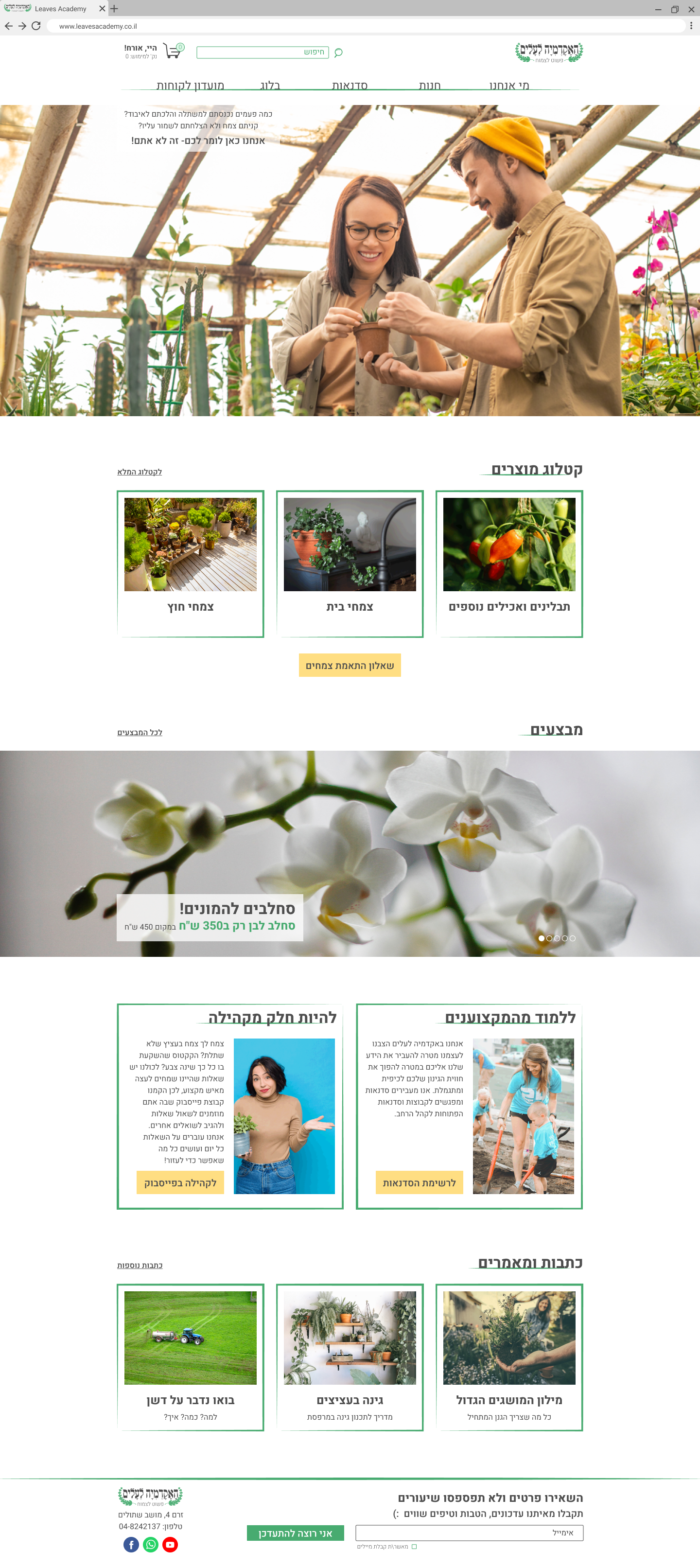

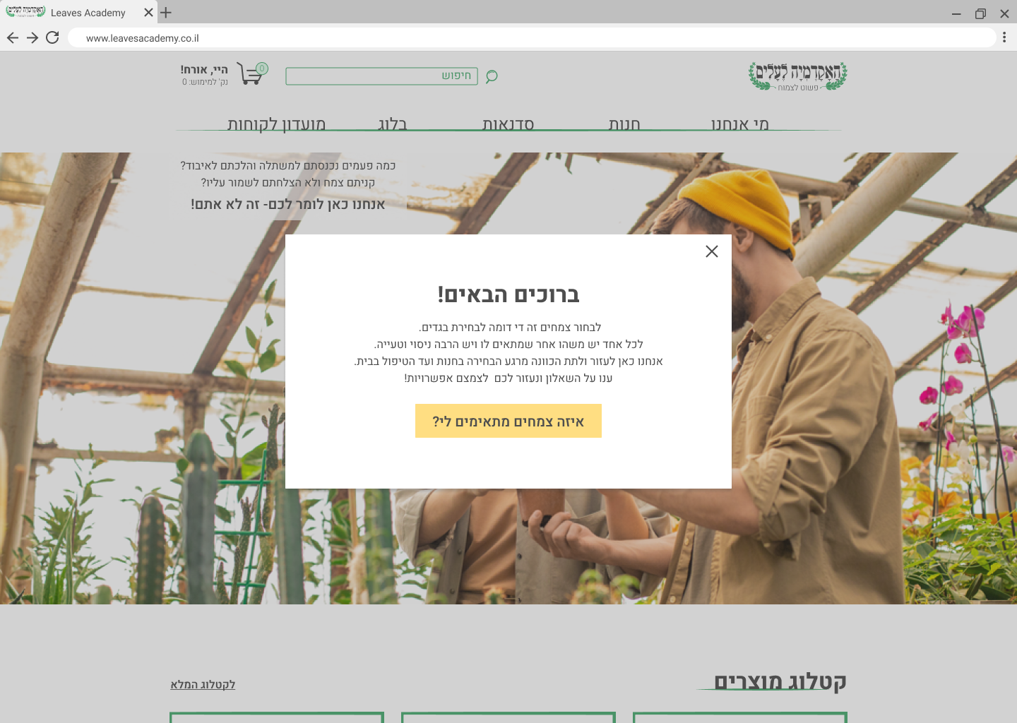


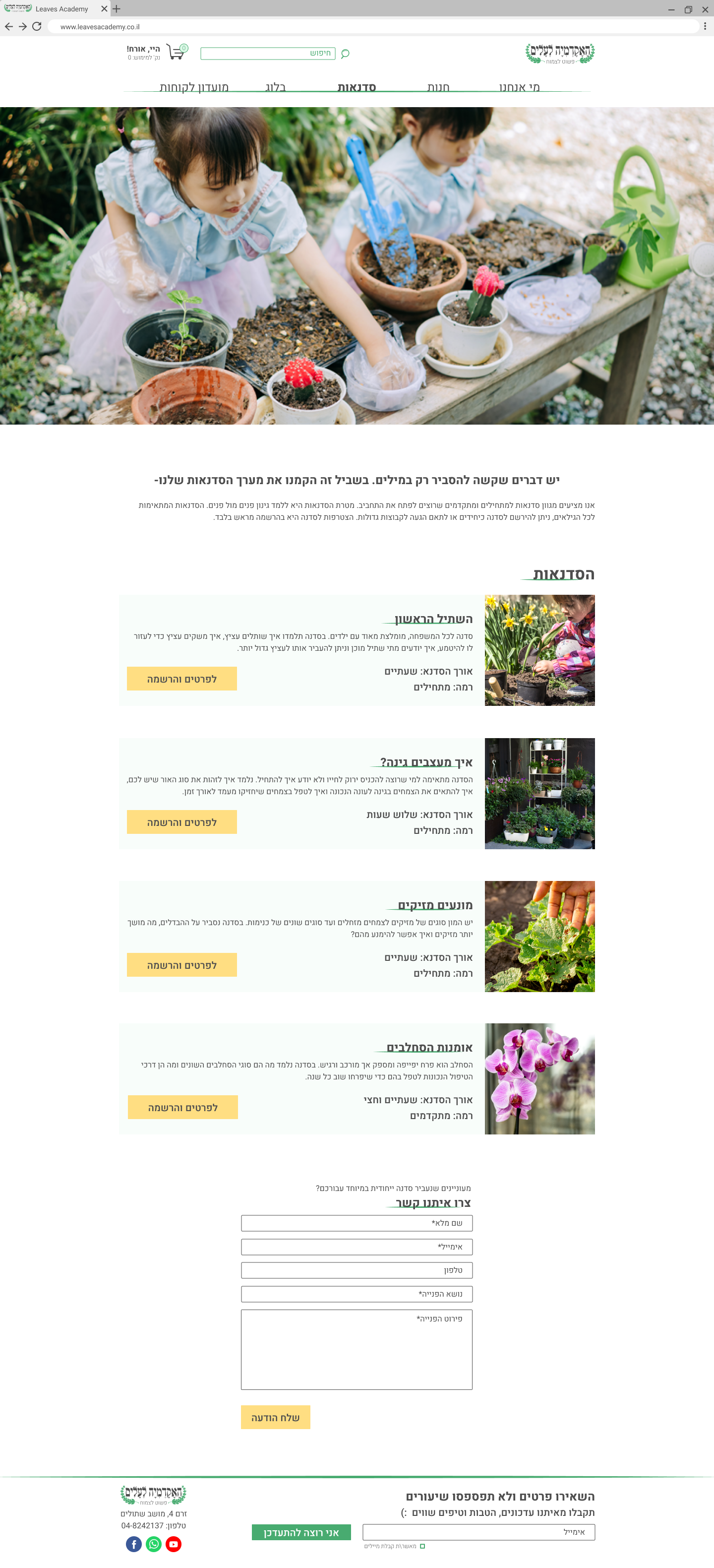
The main feature of the website is the online store. To cater to new gardeners, I created (with the help of the staff) a short questionnaire to narrow down choices for the client. The questionnaire pops up on the homepage and is also easy to reach.
The questions are similar to what the staff would ask you if you were to go to the shop itself. Hovering over the answers will present a short explanation.

Narrowed down by the client's answers, the questionnaire results are clear and easy to sort.

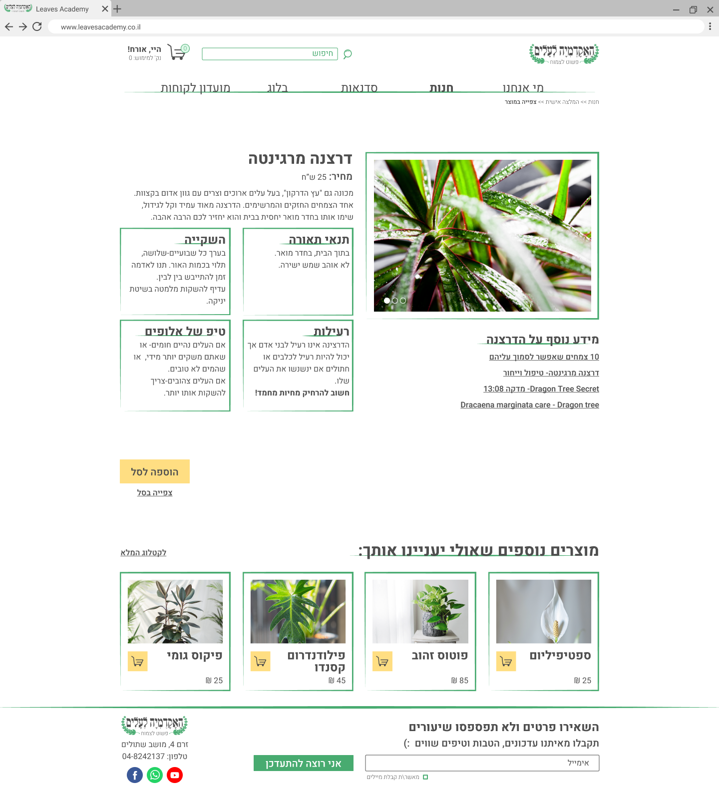
The plant info page's goal is to give as much information as possible without intimidating the client.

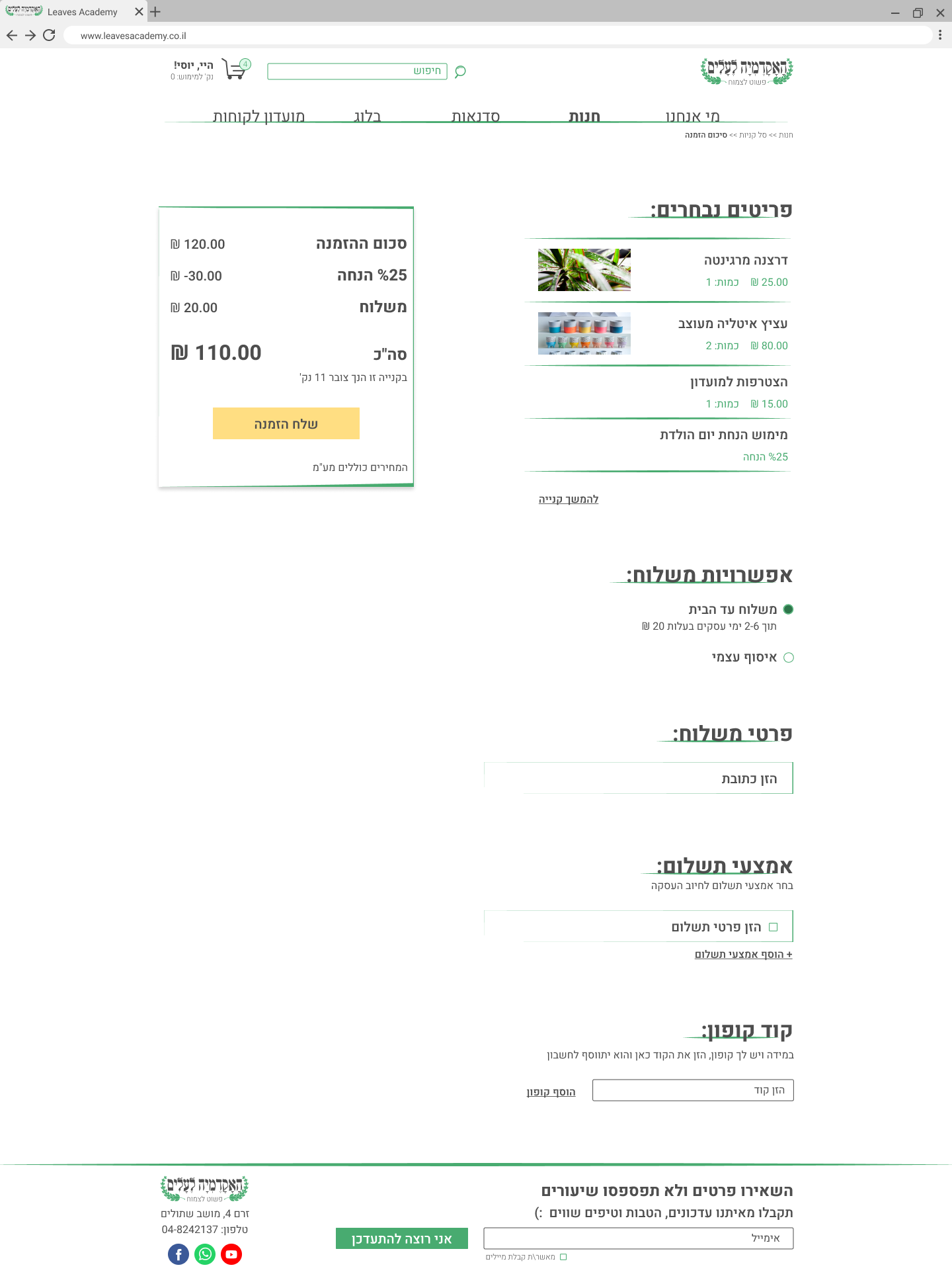
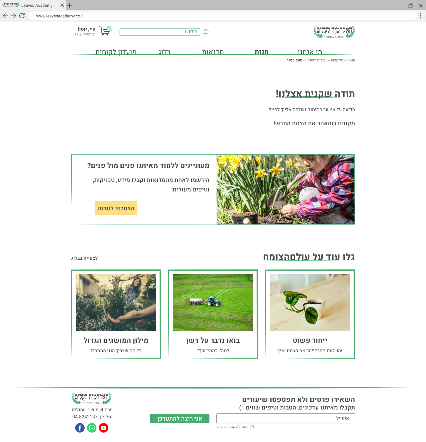
My main guidelines while designing the purchase process pages were to keep things simple and recognizable. With only a few familiar steps, the process’s goal is to lead the customer to checkout with ease.
Join Membership Popup
Delivery Details Popup

Payment Details Popup

Thank You Screen


Design System


